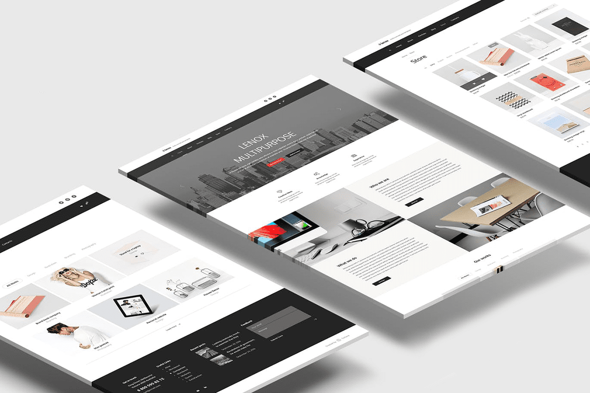
People visit your website to get information about you and decide if it makes sense to do business with you and the first thing they notice is the design, if they do not like the design and they way you answer their questions they won’t be encouraged to contact you and that will cause a business loss, here are a few tips to make you pages’ design more attractive
1. The design clearly answers “Who I am,” “What I do,” and/or “What can you (the visitor) do here.”
If you’re a well-known brand or company (i.e., Coca-Cola) you may be able to get away with not having to describe who you are and what you do; but the reality is, most businesses still need to answer these questions so that each visitor knows they are in the “right place.”
Steven Krugg sums it up best in his best-selling book, Don’t Make Me Think: If visitors can’t identify what it is you do within seconds, they won’t stick around long.
2. Consistency
Consistency in website design matter a lot. Give your attention to match design elements throughout each of the pages. It can be understood that your fonts, sizes, headings, sub-headings, and button styles must be the same throughout the website. Plan everything in advance. Finalize the fonts and the right colors for your texts, buttons etc, and stick to them throughout the development. CSS (Cascading Style Sheets) would come in handy to keep the complete information about design styles and elements.
3. Logo
Your logo needs to do a good job of subtly communicating what your company is about. It hints at the DNA of your business — whether you are professional, creative, aggressive, or laid back.
4. Navigation Bar
This is the roadmap you use to show your visitors what’s important and where they can go to get the specific information they need.
Rule-of-thumb:
- Only include necessary pages and don’t confuse users with too many unnecessary options. Your visitors will not be interested (initially) in pages about copyright, privacy, and terms of services. So insert them elsewhere — like in your footer.
- Create logical groups of related links, with the most important links organized from left to right.
- Keep page titles short and descriptive.
- Place your navigation bar in a prominent location so it is easy to find.
Put yourself in the shoes of your visitors and ask yourself this: “What is the least number of steps I need to take before I can make an informed decision to buy your service or product?“
5. The design is optimized for multiple devices
All the homepages listed here are highly usable, meaning they are easy to navigate and there aren’t “flashy” objects that get in the way of browsing, such as flash banners, animations, pop-ups, or overly-complicated and unnecessary elements. Many are also mobile-optimized, which is an incredibly important must-have in today’s mobile world.
6. Typography & Readability
No matter how good your design is text still rules the website as it provides users the desired information. Since search engine crawlers are very much familiar with this data, it becomes an integral part of SEO activities. You should keep your typography visually appealing and readable for visitors, along with tricky use of keywords, meta-data, and other SEO-sensitive elements.
Consider using fonts that are easier to read. The modern sans-serif fonts as Arial, Helvetica etc. can be used for the body texts. Make proper combinations of typefaces for each and every design elements such as headlines, body texts, buttons etc.
7. Easy loading
No one likes the website that takes too much time to load. So take care of it by optimizing image sizes, combing code into a central CSS or JavaScript file as it reduces HTTP requests. Also, compress HTML, JavaScript and CSS for enhanced loading speed.
