Mobile apps are not only functions and things we can do but also what feeling we feel when we use them. A good app user interface plays the biggest role in making the users keeping the app and using it or uninstalling it. We list some tips on how to design a mobile app user interface like a pro
1. Be Consistent
Your app must follow a general theme. If you add heterogeneous elements to your mobile app ui and you try to mix them together the general aspect won’t be so pleasant. For avoiding such a mistake it is essential to set a goal from the start and to remain loyal to that idea.
2. Keep It Simple
Be careful not to create the sensation that customers need an instruction manual for using your app.Your app user interface should be simple. Keep in mind that every activity needs to be intuitive. In case of a more complex task, you should divide the procedure into simpler stages.
3. Offload Tasks
Look for anything in the design that requires user effort (this might be entering data, making a decision, etc.), and look for alternatives. For example, in some cases you can reuse previously entered data instead of asking the user to type more, or use already available information to set a smart default.
4. Home Screen
Once a user accepts push notifications, we’ll send them directly to their home screen. This would be a great time to give them a basic walkthrough and explain some of the mechanics of the app, but we’ll save that for another day.
Honestly, if we stick to the common user interface design principles, we may not need a walkthrough at all. The app should be intuitive enough to understand without too much hand holding.
The main information we want to show on the home screen is:
- We want an element of gamification, so we’ll show their stats nice and big at the top of the home screen.
- Below the stats, we’ll show their current lessons, their progress, and locked lessons. We want to make sure that it’s obvious that these lessons are inaccessible. This will entice the user to unlock them every time they visit the home screen.
- I want the app to be very visual so I’m going to try and incorporate nice photography into each page.
- Since this is the home screen, the user should be able to go anywhere from here. To begin with, our app will offer some basic user settings, so we’ll make sure there’s a way to get to settings screen from this home screen.
- Now that we know what we need to design, we’ll throw together a quick sketch so we can get an idea of how we want to lay these elements out visually without having to do too much work.
- Now we’re in a great position to fire up Sketch and start designing the elements of our home screen. Most of the work has already been done, so it’s just a matter of putting each element where is belongs and adding a splash of color.
- With the home screen complete, the user now has a place to track their overall progress, as well as the progress of each individual lesson, purchase new lessons and tweak their user settings. Nice!
- Jerry Cao, UX Content Strategist at UXPin, spoke to us about the importance of content in mobile app design:
- “Content is always important in design, but its importance increases as your screen real estate shrinks. When creating a mobile app, use real content as soon as possible. Rough content is totally fine – the goal is to design with realistic spacing constraints. If you rely on lorem ipsum too much, you might break the interface once you flow in the real content.”
5. Don’t drain the battery
In Nov 2018, Google at Android Dev Summit, revealed on how a smartphone spends its battery life. They shared that the biggest factor in battery consumption are screen brightness and screen colour.
If the app is heavy on calculations or complex navigations, there is a higher chance of mobile battery drain. Background services such as location detection are high on battery consumption as well.
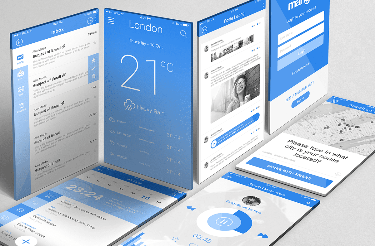
The last thing a user needs in an alien city with heavy rain is their mobile battery running out. Keep the UI simple — lesser, darker colours, shorter navigation and to the limited background services.