Good email signature gives a very good impression when readers know who you are, what you do, and provide them with more ways to contact you. When you correspond with people via email, they not only get to read your words, but they get to see more information about you and your company through your email signature.
1. Characteristics of good email signature design
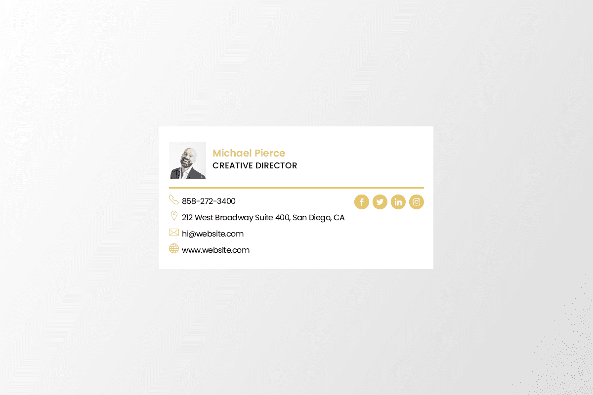
- Include your name, role and business name
- Add a short tagline that describes what your business is about
- Include a few of your best contact details, but not all of them
- Small images and logos work best for both design and compatibility across smaller mobile screens
- Use grey or black base text and subtle highlights in your brand color to make the design really pop
- Promote your social media pages using social media icons
- Use a smaller font size to break up the design for Green Messages and Disclaimers
2. Don’t put your email address in your email signature
It’s an unnecessary waste of space because:
In nearly every email client, hovering the mouse over the sender’s name will display the address, unless it’s already visible.
You can always just hit reply.
Save the real estate for something that actually adds value — i.e. links to social media profiles, your company’s blog, your portfolio, etc.
3. Use design hierarchy
Good design is all about presenting your information in an easily digestible manner. Because your email signature is likely more a list of information than it is a compelling story, you’ll want to use hierarchy to direct readers’ eyes to what they should be reading first.
Scale your name up to a larger font so that it attracts the most attention, like you would on a resume. Then, pick and choose information to bold and color based on importance so you can help guide people’s eyes logically through the design.
4. A Call-to-Action
This is a line of text that prompts your recipient to take action. The action you want them to take could be just about anything: schedule a demo, attend an event, download an ebook, etc.
Caveat: Listing every possible phone number, email address, or social media network you belong to is overkill. In fact, the more pages you link to, the less likely it is your recipient will click on any of them any of them — a phenomenon known as the Paradox of Choice.
5. Align your design
Here’s a secret for you: the difference between a neat, organized and effective signature, and one that just looks crudely thrown together is alignment.
By simply aligning your graphic, type, and icons in a logical and simple way, you can bring order and harmony to your design in an instant.
Taking the time and care to align your signature on the page itself is very important, too. A majority of email signatures are left aligned as left alignment is generally easiest for the eye to navigate and read.
6. A Photo Finish
If you use a photo in your email signature it needs to be a professional image. Avoid using selfies or obvious crops from other photos.
Here are some pointers to help you get the most from photos in your email signature:
- The image should be small. An image that’s too large takes too long to load.
- Use a neutral photo background. A busy background distracts the reader.
- Dress professionally. Make sure your hair and grooming are also professional.
- Look straight at the camera for a more approachable image.
- Use a headshot rather than a full body photo. (Your face will be too small in a full body image.)
7. Test, test and test some more
Sending and receiving email signatures to and from email clients like Outlook and Gmail, all have their own little quirks that we must deal with. Test your signatures across all major email clients to make sure it’s looking it’s best or your signature may not be looking as professional as you think it does, when it arrives in your recipient’s inbox.
8. Let people book time on your calendar right from your signature
If you find yourself emailing back and forth with colleagues and clients who want to book meetings with you, make it easy for them by including a link to book your calendar right in your email signature.
There are many tools out there that’ll help people book appointments. Use HubSpot’s shareable personalized booking link. If you’re a HubSpot Sales customer, you can share your personalized meeting link with anyone who you want to book a meeting with and let them choose from your available times. If you want, you can make it so the HubSpot CRM automatically creates a new contact record for anyone who books a meeting if one doesn’t already exist.
9. Make it mobile-friendly
The data is in: the number of people who open their emails via a mobile device is just increasing as time goes on. In fact, as Campaign Monitor notes, 41% of people open their emails on a mobile device as opposed to a desktop setup.
There are a lot of technical aspects to consider when making your email signature responsive and mobile-friendly, but let’s talk design.
The number one thing for you to keep in mind is scale. Mobiles are significantly smaller than desktop setups, so be sure that both your type and your imagery are legible when scaled down onto smaller screens.
If you encounter this problem with your own brand marks, consider replacing your logo with a simpler version, or a logo signature that is scalable.
Another thing to consider when moving from desktop to mobile is ensuring your links are ‘tappable’. This means ensuring that your links aren’t too small or positioned too close together, otherwise, a thumb may try to tap a Twitter icon, but trigger an adjacent icon and be taken to the Facebook page.
This is not to say that you should scale every element up in your design, but rather keep in mind that not everyone will view your signature at the exact same size that you are sending it. Screen sizes change and it’s always a good idea to anticipate that change and plan ahead.