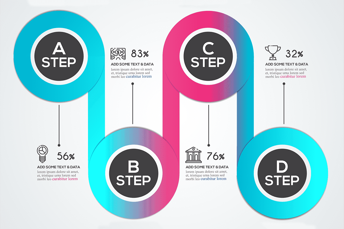
Infographics help you to deliver your message in a very organized and effective way, good infographics are shared on millions of websites and social media channels, making infographics is what you need if you want your brand to stick in the brains of your potental customers
1. The Story
The purpose behind an infographic is to tell a story. Without a story, an infographic is just a graphic. Ask yourself:
- What is the story I want to tell?
- Is it relevant to my organization?
- Why am I telling this story?
- Who am I telling this story to?
2. Create your infographic for your target audience
Coming up with an infographic idea is half the battle to creating a killer infographic. And the way to come up with great infographic idea is to figure out what your audience wants.
The infographics with the most traction, most attention, and most virality, are ones that meet your target audience right where they want it most.
One mistake that I’ve seen people make when creating an infographic is that they try to choose something that is generically popular rather than specifically relevant to their audience. Your goal is to create an infographic for your audience, not necessarily for the whole world. Keep it specific, relevant, and targeted.
3. Visual Style and Flow
An infographic needs a strong visual presence to draw users in. Most infographics read from left to right and top to bottom in a more vertical than horizontal format. This style is by design because it mirrors natural eye movements and reading patterns.
But there are a few other things you can do to enhance visual style and flow:
- Use a color palette. It just like any other design project.
- Adhere to a style guide. Even this small-format story needs to include consistency.
- Place information using the inverted pyramid, meaning that the most important information is at the top and gets less significant as the user moves down the image.
- Keep it readable. Optimally, users should be able to see most of the information at a glance and everything should be readable. If you find that your infographic needs to be a little on the large size, break it into manageable parts so that all the information from one section is viewable at one time.
- Remember scale. With data visualization, context is important. Turn any text that you can into a visual element, but remember to provide enough context so that it is easily understood. If one element is twice as big as another and you use circles to represent this, one circle should be double the size of the other. (Simple, right?)
Infographics are appealing because they mimic the way our brains work. This visual representation of information is easier to think about, understand and retain.
4. Provides a new angle
You want to provide a new angle. One of the most common mistakes designers and non-designers make when they create infographics is this format where they create a list, in a way it’s a little bit better than a bullet list where you have visuals composed with supplementing the text but however at the end of the day it’s not really a true infographic.
5. Isn’t Overly Self-Promotional
One of the best ways to ensure an unsuccessful infographic is to create one that’s all about you. If you want your infographic to get shared a ton, avoid focusing it on data about your company, products, and services (unless that’s the goal). Instead, focus it on a topic in your industry that more people will care about and naturally want to share.
6. Make it a manageable length and size
Infographics are supposed to be big. We get that. But go too big, and you’ll start losing people
I recommend a limit length of 8,000 pixels. Anything longer, and you’ll start to presume upon your user’s attention span.
Along with a length limitation comes a necessary size limitation. Users might be on a slow connection, so be courteous, and keep your infographic to 1.5 MB.
7. Call to Action
Don’t forget that your infographic should always have a goal. Why did you make it? What should people who see it do?
Remind users to share.
Include an embed code or link to drive users back to your website. (Some of the infographics in this post do that.)
Don’t forget to include branding or identification.
The website above is an infographic and is different from the other flat infographic examples. (Also note the call to action midway down the page.) Don’t be afraid to think differently when creating an infographic.
8. Add white space
An infographic is an exercise in graphic design best practice. Any graphic designer will tell you that white space is important.
Good infographic design includes a balance of visual elements with the necessary negative space to help guide the viewers as they look at the infographic.
9. Cite your sources
Just because you’re making an infographic doesn’t mean that you’re released from needing to cite your sources. Where did you get your data? Cite it.
Try to use sources that are as up-to-date as possible. Using old stats, especially in an industry where information is always changing, makes you seem out of touch.
I usually cite the source of my infographic data at the very end of the infographic.
You can also cite sources within the body of the infographic, as long as it doesn’t distract from the flow and visual of the infographic.
10. Is Promoted
Once you produce your awesome new infographic, promote it! Create a post on your blog to feature it, and share it in social media and via other promotional channels. Consider creating an embed code that you share within the blog post to encourage people to post it on their own websites/blogs, too!
