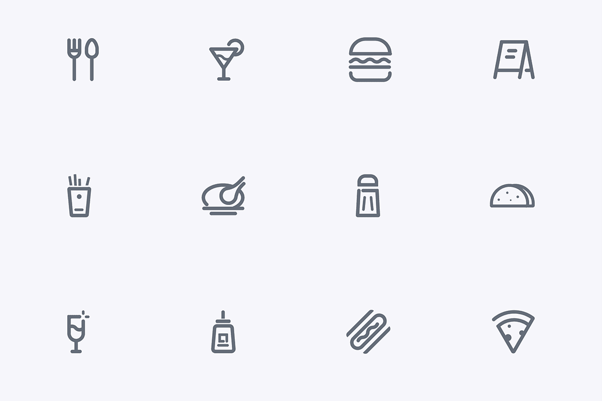
Using icons is no longer optional in apps and websites design, people got used to them and most of the time they do not read the text around them because there are icons design rules make your website and app easy to use even when people use for the first time. Here we list some principles of effective icon design
1. Approach Icon Design Holistically
Icons fit within graphic systems. Whether they are designed for desktop applications or Web sites, an icon is one of many graphic elements that need to work together harmoniously. Carry this logic across icon sets as well. Icons can be appreciated for their aesthetic solutions individually, but they don’t function alone. Evaluate your icon designs relative to the graphic system you’re using them in. Make sure that each icon differs from surrounding icons, while still working together as a whole.

design.tutsplus.com
2. Universal
The concept of each icon should be able to be understood by the entire audience, it’s important to think of differing points of view across culture, industry and demographic.
3. Enhance
An interesting or unique style can enhance the user experience or aesthetic of a website or UI, and bring to life a brand.
4. Make It Easy to Read
An icon needs to be easy to read. (And we’re not talking about text.) Visual legibility is key.
The icon should include a visual that is highly recognizable because of branding or because it is easy to understand. Think about the icons on the desktop of your computer for example. You know where things are located because of the simple nature of icons – documents are stored in folders, music is played from a button in the form of a musical note and images are stored in a location that looks like a Polaroid photo.
When it comes to visual legibility, branding is a big part of the consideration. Big, household brands often have icons that are a part of their logo or an iconic image. People tend to recognize these elements right away even at small sizes. This can be a little tougher for new or smaller brands or icon concepts and designers may opt to go with other techniques for optimum impact.
5. Cast Consistent Lighting, Reflections, and Shadows
It’s important that the realism you add to your designs all function coherently. If you use a light source coming from one direction then stick with it. Or you risk losing the integrated design of your icons. Also consider the light source of the design your icons will be placed in. If the light source of the icons is at odds with the Web site or application design you’re using them in, then the design will appear amateurish.
In the Windows Vista User Experience Guide there is a section on icon lighting and shading. The guidebook gives really specific rules for the Vista Icon set. This gives more exacting standards for icon designers and ensures a unified icon system. Following is a specific rule to see an example, “Use shadows to lift objects visually from the background, and to make 3D objects appear grounded, rather than awkwardly floating in space.” There are many more rules in this guide.

design.tutsplus.com
6. Navigate
Icons can play an important part in navigation, commonly used in UIs, and websites. Use on website navigation should be used with caution however, as navigation bars can easily become cluttered.
7. Decoration
Nice looking or interesting icons can help present information in a visually appealing way.

8. Use Vibrant Color
Want your icon to stand out? Go bold with color. A vibrant color choice will help you app stand out on a variety of backgrounds and will grab the attention of users.
The last thing you want from an icon design is for it to blend in with all the other options available. This makes blue – especially sky and navy hues – a color that you will likely want to avoid because so many other icons use it.
If blue is your primary logo or brand color, try to pair it with something brighter for impact. Consider a “new neutral” such as lime green, or opt for a seasonal hue such as a bright orange in the fall or bright pink in the spring.
9. How to Design a Better Icon
Crafting a good icon or set of icons is more than just hopping on to some of the latest trends in icon design. Because of the small size of icons, attention to detail and precision are an important part of the design process.
Simple rules still hold true for icon design in 2019. Pair these guidelines with some of the trending ideas above to create something you’ll love:
- Start with a grid
- Build with geometry
- Create a unique shape
- Give icons plenty of room
- Stick to your brand colors
- Use consistent divots
- Design for the smallest size you need
- Don’t decorate
Conclusion
Icons are a useful design tool. From use as app icons to website marks or favicons to divots that can be used in a logo or throughout a design project, the icon is a mark that’s here to stay.
Approach icon design in the same way you would almost any other project, but really think about simplicity and size. Icons are made to look at quickly and are often small in size. This can have a great impact on the design.