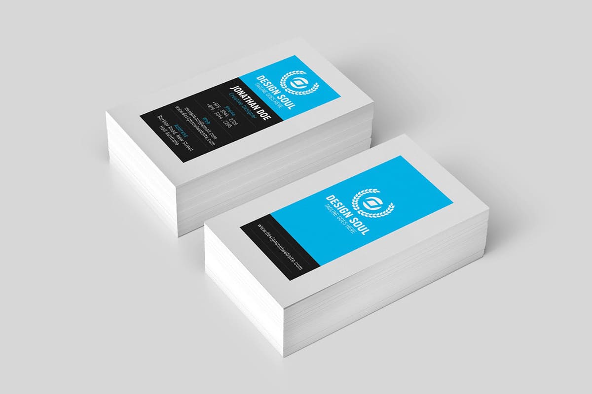
Business cards are still an important marketing asset of a business. If you haven’t got a card that you can hand out to prospective clients or collaborators, a business card makes customers feel that they know someone in your company, a quality business card design makes customers more willing to deal with you and here are some features to make a great business card design.
1. Size and shape
Before you sit down to design your business card, it’s important to know what size and orientation your card will take. This not only influences the text size and amount of information you can include but also communicates things like whether you’re conventional or a bold non-conformist. Horizontal rectangular cards are the format most people are familiar with. Vertical cards are less common and can be used to differentiate you from your competitors. If standing out is your goal, then you might also want to consider a specialty plastic business card or ColorFill extra thick card with an eye-catching layer between the front and back sides. Decide where your business lies between understated and bold.
2. Logo
Your logo should be the most prominent feature, followed by your name. Your logo will dictate the colors you use on your card. Two colors are standard for such a small card, but you can experiment with duotones. The logo can take up half of a one-sided card, and the entire side of a two-sided card.
Your logo fonts can dictate the fonts you use in the rest of the card. If your company has something to do with children, feel free to use one child-like font and one common font, like Helvetica. The “fun” font can be used for larger text like your name, and the readable font should be used for anything smaller. If you want to convey professionalism, use different weights of a font like Helvetica (like Helvetica light and Helvetica bold), and stick to black and white colors.
3. Include only the most important information
It’s tempting to reduce the font size and include every last bit of information you have on your business card. Some designers make cards that include the staples (name, title, business name, phone, email, website), plus every social network profile, a sales pitch, a comprehensive list of services and a bio. If you have this much information on your card, you are most certainly losing the recipient’s attention due to information overload.
You want to include enough to pique the interest of the recipient and make it memorable, without making his or her head spin. Skip the kitchen sink, and keep your business card simple by being selective about the information you include.
4. Avoid full coverage
With affordable business card printing, it’s very common to have full-color text and designs on both sides of your business card. But, avoid the temptation to completely cover every white space on your card, unless absolutely necessary.
It’s impossible for your recipient to make notes or jot down a memory trigger when there is no room to write, when there is a dark color covering the entire surface, or when a high-gloss finish is applied to both sides. For those who regularly use business cards for note-taking, your black, glossy card may not make the cut for them.
5. Be consistent with your website and other promotional materials
This way, it will be easier for your customers to remember and recognize you. If you don’t have a website or other marketing materials, but your business has an established logo or is well known for something in particular (be it your sign, the building, the uniforms of your staff, etc.), try to integrate that into your business card design.
6. Get them professionally printed
While you could print your own business cards at home on your inkjet printer with perforated business card paper, please consider professional printing instead. Unless you have commercial printing capabilities, DIY business cards might not make the best first impression.
You may be able to save a moderate amount of money and update your information easily if you print them yourself, but the impact of handing over a homemade business card isn’t the same as cards that are printed professionally.
7. Make your business card sticky
Forget marmalade fingers, by ‘sticky’ we mean how long your card will be in a place where your customer can see it. We’ve seen magnetic cards work very well for businesses offering recurring services like plumbing, house painting, gardening, pet sitting, hairdressing, car services, etc. People put them on the fridge to refer back to on a regular basis.
