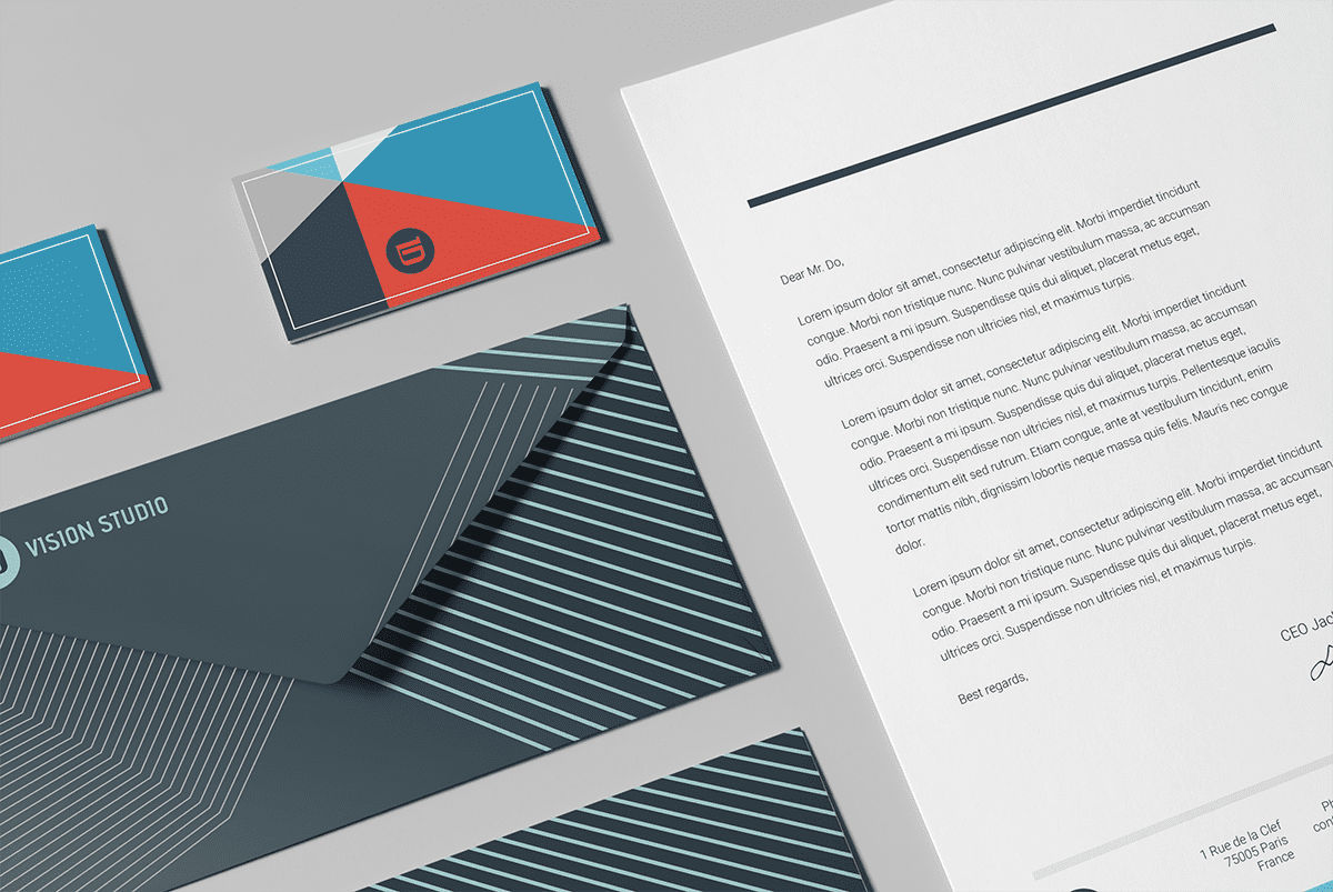
Business stationery designs can be rather dull, dry, drab and mundane.
Alternatively, it can be very well designed to convey loads of information to business associates, customers and others.
Unfortunately, many businesses overlook the significance of their stationery, falsely believing that few would be interested in studying the bit of paper carefully.
1. Keep it simple
- Keep typography styles minimal. A maximum of two is recommended.
- Keep colors minimal. A maximum of three is recommended.
- Incorporate white space where possible. This will break up the content while giving your design a clean, professional look.
2. Incorporate your brand
From color schemes and typography to your logo and other imagery, your stationery should represent your brand in all aspects. Of course, you shouldn’t feel obligated to incorporate your brand elements in any particular way.
With many different stationery items (like letterheads, business cards and labels), you have many inclusion options. For example, you can make your company’s logo the background image of your business card while also using it on your letterhead as the break between your business information and content.
3. To be highly useful as marketing, networking or brand building tools, you need to include five essential elements in your business stationery designs.
Other than the name, address, contact details and website of the business, a few other elements can be included on stationery to serve as effective marketing, promotion, customer service and networking tools.
- 1 – Corporate logo design
- 2 – Catchphrase
- 3 – Year of establishment
- 4 – Helpline or consumer contact numbers
- 5 – Certifications
4. Organization matters
Last but not least, the organization of your stationery can make or break your design. After all, you want your stationery to be beautiful, but also functional and legible.
- Use a hierarchical ordering. This means using headings and font elements (such as bold and italic).
- Use typography and colors to distinguish sections. To support your stationery’s organization, use branded elements to further break up the ordering.
- Choose legible colors and typography. Bold colors and easy-to-read font styles are important if you want to deliver your message clearly.
To color or not to color
While conventional wisdom says muted colors are more professional, keep in mind a good design breaks all the rules. Take for example, 2+2’s super fun design for a consulting firm. It demands attention with its colorful palate, while still being professional and polished.
Is it right for every brand? No, especially considering that color will impact the cost to print. But it will definitely help the client stand out in a crowded marketplace of boring consulting firms! On the other hand,the stark black and white design can bring a minimalist heft to a suite for any company.