A marketing brochure is a printed piece of marketing that often includes text and images on 2, 4, 8 pages inserted or a booklet format. A brochure is a print design option companies use to promote their services and reach potentials customers
1. Appropriate format
This is the very first step you’ll have to take when creating a brochure. You will usually discuss this with your client, so try to recommend the right medium for the message and type of product your client has to get across.
For example, a tri-fold or z-fold brochure will not be the best choice for luxury products that require lots of white space and big pictures. You will choose one of these narrow formats when you want to present documents that are easy to hand out.
Of course, it is better if you get creative with the format of your brochure. Nowadays many concert organizers create brochures that unfold into a poster. It makes it easy to send by mail, and practical to hang somewhere in the room to make sure the brochure stays visible all the time. The better looking the poster, the more people will hang it, so be artistic if you create this kind of poster.
2. Limit your fonts
You don’t need many fonts when you’re thinking of how to design a brochure – just a heading, subheading and body copy font. But we see it all the time: people think they need to find a headline font nobody has ever used before. Clients will usually take the lead on fonts as they’ll often have a corporate identity already in place.
3. Be selective about paper stock for your brochure
Paper is the tactile part of the brochure experience. The quality, weight, and coating of your brochure can speak volumes in and of itself. Does your brochure call for something special? For a more substantial brochure, you’ll want to use a heavier stock, and especially for the cover of a multi-page brochure. If however, your brochure requires multiple folds, a thinner paper (but not too thin!) will allow the piece to fold cleanly and remain closed flat. If your brochure is a throw-away piece (for example, information and registration for a one-time event), you don’t want to spend extra money on more expensive paper.
4. Avoid big words
The more complex the words you use, the lesser the credibility you’ll receive. You don’t have to impress your audience with fuzzy words. In fact, the more you use them, the harder it is for you to convey your main point. For brochures, simple English is the best route to take.
5. Don’t put a picture of your building on the cover of the sales brochure
Sure, you’re proud of the building and the way the company has grown. But your customers really don’t care how proud you are of your company, or how big your building is. You need to design your brochure to show what the customer wants to know — and that’s whether or not your products meet their needs. Don’t waste space you should use to sell your products and convince customers to buy now.
6. White space
This may sound like dull advice, because it could be given for any kind of graphic design project, not only for brochure design. It is however important to remember to keep some well-balanced white space on your brochure for the sake of aesthetics and readability.
I will not go over how to use white space in your designs, I’ll just assume that you know how to do it as a graphic designer. The problem you will run into will probably be that your client doesn’t understand the importance of white space.
7. Get your copy right
You may not want to hear it, but excellent copy is crucial to great brochure design
Great copy is often the most undervalued element in brochure design. A lot of people don’t understand that copy needs to be considered as part of the overall design concept. At the early stage of any brochure design project, experiment with the copy to see if it needs reworking. Headlines aren’t something to just drop in later.
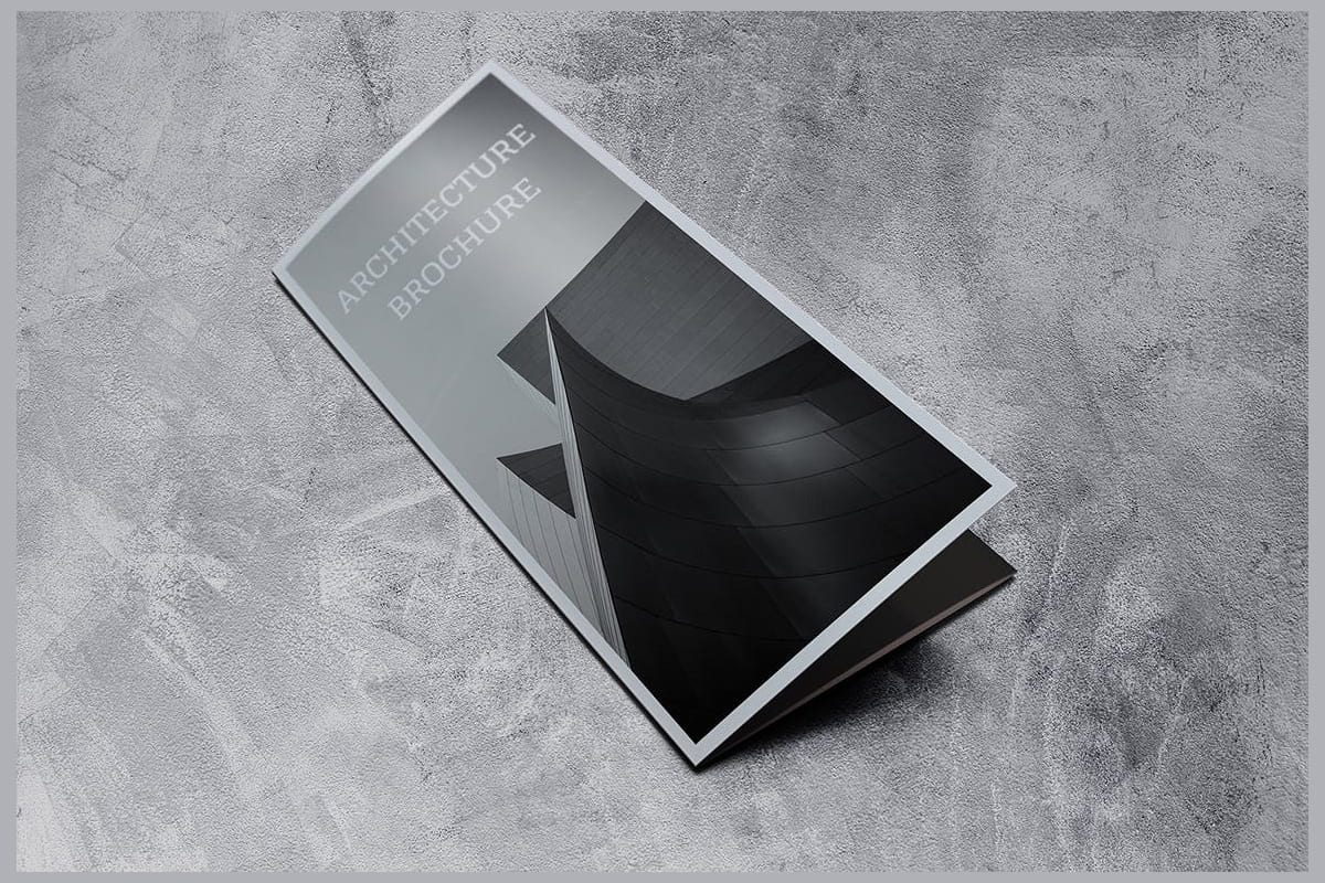
8. Create a compelling cover
Don’t kid yourself — yes, of course people judge a book by its cover. As tempting as it is to simply throw your logo and maybe a nice stock photo on the cover of your brochure, is that compelling enough to make people open it? Is it unique enough for you to differentiate yourself? Maybe, maybe not. However, don’t disregard that real estate — it’s prime! Consider using a catchy headline, call to action, or engaging question on the cover of your brochure. (Keep it short, though; you don’t want too much clutter on your cover.) And remember that if your brochure’s ultimate destination is a brochure rack, it’s possible only the top third of your brochure will be visible, so that is particularly prime real estate that you’ll want to pay attention to.
9. Add a call-to-action
However well-designed your brochure is, if it doesn’t include a call-to-action, it won’t serve its true purpose. Never assume that your audience will buy your product or go to your event just because they’re moved by your beautiful brochure. It doesn’t work that way.
Even if you have an eye-catching brochure, it’s still imperative that you provide motivation for readers to get in touch with you or try what you’re offering.
10. Make it easy to respond
Be sure your business name, phone number and website url are easily found in the sales brochure or flyer. Add your FaceBook, LinkedIn, Google+ Pinterest and Twitter pages, if you have someone who watches those regularly, too. A QR code that takes people either to your product page or to a page to signup for your newsletter is yet another option to consider.