Here are the most effective tips to make your business flyer works well and to be kept by potential customers
1. Function Before Form
Whether you’re advertising a computer sale or a club, you need to remember that your flyer has to be striking enough to be picked up and looked at. The information on it also has to be clear and concise enough to convince that person to check out your shop or attend your event.
Prioritising function over form before you start out designing will help to get your brain in the right place. Of course, design plays a significant role in converting sales, but it isn’t necessarily the most tastefully designed business flyer that will push the right buttons.
Keep the information concise—edit the text content down to the essential information only and don’t be tempted to waffle. A flyer reader’s attention span is super-short, so make what they read in that split-second count.
Make information easy to read—make sure your font sizes are large and your leading generous. And don’t be afraid to let a big, bold header dominate a large part of the flyer.
Make contact details and other essential information instantly accessible—pull out a website address in a bold color, or make sure the date and time of an event or sale is blown up to large-scale.
Apply a WYSIWYG (What You See Is What You Get) attitude—if you’re selling a product make sure to feature an image of it.
2. Put Emphasis on Keywords
Certain keywords or phrases can help sell the information in the flyer design. Make them bigger, bolder or brighter than other lettering to create distinct emphasis.
What kind of words are attention-grabbing? Consider the following words if they are part of your strategy:
- TDP – time, date, place
- New
- Free
- Easy
- Save
- Now
- Guarantee
- Limited
3. AIDA
Both flyers and brochures should be planned according to AIDA, which stands for Attention, Interest, Desire and Action. In short, your design and text should:
Grab attention – Your design and text should be compelling enough to make a potential reader give it a second look.
Interest – Your text and images should be sufficient to create interest in the reader, causing them to read on, rather than stop after the headline.
Desire – Your text and graphics should be enough to create a desire within the reader for the product or service being highlighted in your flyer or brochure.
Action – You need a call to action in your material. This can be as simple as “Call us at 1-800-BuyStuff”.
4. Find Balance
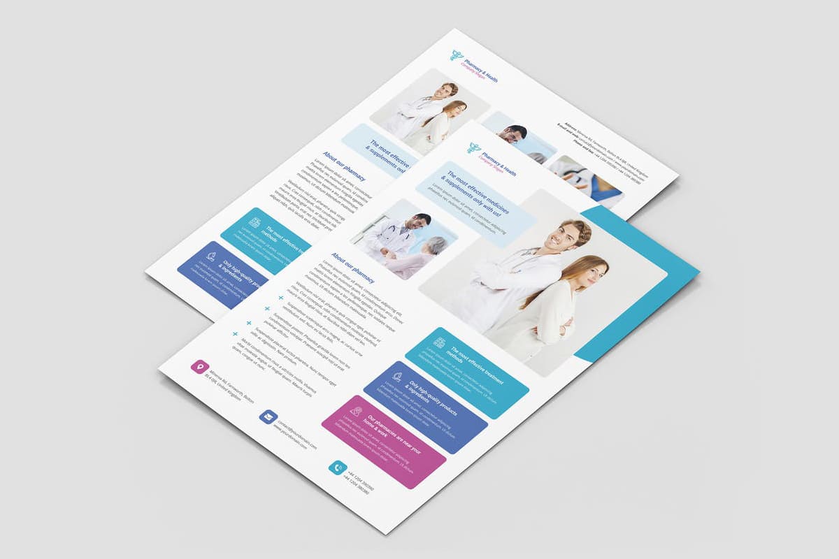
One thing that’s sure to discourage people from looking at your business flyer is a crowded, busy layout. If there’s so much information crammed onto one page that discovering what the business flyer is for and finding information looks next to possible, then viewers are likely to just walk on by. On the other hand, a balanced, well-spaced layout makes the whole flyer easy to see at a glance and makes pertinent information easy to find.
Aside from limiting your content to only the most important information, one of the biggest factors in achieving a balanced layout is making good use of white space, or blank areas without any words or graphics. While your first inclination may be to fit as much as you possibly can onto your flyer, that approach won’t do you any favors. And including white (or blank) areas in your layout isn’t wasted space — it helps direct the eye to the focal point and other content. Think of those blank areas as a roadmap that viewers use to navigate your layout, traveling from one design element to another.
Bonus Tip: Taking advantage of the margins and alignment settings or tools in your chosen design program can make even a content-heavy flyer look more balanced. These settings work in combination with white space to help organize your layout.
This concert flyer features both white space and strategic alignment (notice the left- and right-hand aligned blocks of text on the opposite sides of the page) to separate and organize its content. The result is a balanced layout that creates a dynamic, diagonal composition that easily leads the eye from one design element to another.
5. Try to Make Your Flyer a Keeper
Flyers are cheap to produce, often printed on low-weight paper with unfashionable gloss finishes, and as a result they are rarely seen as items to be treasured. They are the workhorse of promotional print items but many often end up in the trash.
A beautifully-designed flyer is much more likely to be kept by a potential customer, and may even be pinned up on display at home or at the office if it’s particularly attractive.
Print flyers can be used as a long-term reminder to a consumer. This will only be a realistic aim if, however, you’ve created a flyer that’s attractive enough to be kept around in view for a longer period of time.
If you treat your flyer like a mini poster design, using striking images, beautiful colors, and stylish typography, it’s less likely to be thrown away as soon as it’s been picked up.
Resources: