8 Tips For A Creative Poster Design
Event posters are usually the first piece of media created for an event. Posters can be powerful in creating excitement & interest for your event if done correctly.
Posters can come in a variety of formats if your end goal is print and distribution. Here are the elements you should consider when designing your poster for the web.
1. Goal
What am I trying to achieve? This should be the first thing you ask yourself before you get to the design stage. More often than not, your overall goal directly determines the outcome of any piece of media you create. Are you looking to generate excitement or promote a sale? The message you’re trying to convey should be clear and should remain at the front of your mind during the entire design process. Similarly to any business endeavour, having goals also allows you to track the success of your poster. Are you getting more customer engagement? Have you had an increase in ticket sales directly after the poster was made public? Depending on the size of your event will determine if this is necessary or not. If your poster is part of your content strategy, then analysing the results will prove invaluable. If your business/event is smaller, then this may not be as important. However, it is useful to know how your audience responded in case you create more posters in the future.
2. Information is Key
First things first: make sure you’re presenting your information in a clear, clean, and concise way.
A poster that’s overloaded with everything from the title, the date of event, and the ticket price to the availability of early bird-priced tickets, event rules, and parking locations may seem like the appropriate thing to do. Some people might even argue that the more information you put into your poster design, the more people you’ll attract to your event. In fact, it’s quite the opposite. With more information crammed into your poster, your audience will become more and more confused and overwhelmed.
To minimize confusion, be smart about how information is presented in your poster design.
3. Call-to-Action
Many posters serve to advertise shows, concerts, movies or other events. Your goal is to entice the viewer to respond to your art in some way, shape or form – by making a call, hitting up a website or heading to a show. Can you think of an out-of-the-box way for them to take action immediately, such as with a coupon code, QR code or by enticing them to enroll or sign up by a certain date for some wonderful reason?
4. It Should Be Readable From A Distance
Posters are visible from a fair distance because of their large sizes. But the information they convey should also be readable from a reasonable distance. People do not care to come too close of a poster to read it. Not many of them will read a poster in fine prints.
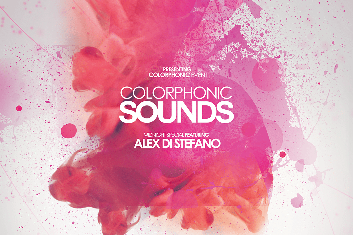
The text is displayed in a poster design in three distinct layers. At the top, there is a headline in bold letters. It is readable from a distance because of the larger fonts. Opt for a readable but interesting typeface that draws attention.
The second level of text is the details. Give the primary information and the message of your poster. But provide the details in the font size that is half of the main headline. Or, if you want to use a larger scale, make sure that it is distinctly separated from the headline. Other details that are of minor importance can go at the bottom of the poster in smaller fonts.
5. Use color to create energy, elicit a mood and attract the eye
Color is one aspect of the design that’s wide open. Colors will create energy, elicit a mood and attract the eye. Depending on the poster subject, the colors will be bold, subtle or romantic. You can really go all out with color.
6. Visual material
Images should support messages visually. They must have a direct connection to the core message of the poster. The chosen pictorial material should not overload the poster and confuse the viewer. Additionally, the legibility of the font should not be impaired by a dominant effect of the integrated images.
To make sure that your poster meets the standards of effective poster design, there are a few questions you should ask yourself when analyzing your draft poster designs:
- Is the message clearly aimed at the target group?
- Is the creative implementation of the communication goal tailored to the target group??
- How high is the degree of credibility/identification of the message for the viewer?
- Will the poster catch the attention of the public?
- Is the design clear and understandable?
- Is the poster designed in an original way?
7. Format and structure
Format and structure can often be overlooked with emphasis on making everything look pretty and neglecting the positioning of important elements. Segment the text into sections: left be important dates, centre explaining ticketing information and acts on the right. This allows you to quickly glance and see each relevant piece of information clearly and with ease.
Sometimes less is more. It’s important for your audience to know as much as they can, but they need to know the important details first. Your audience won’t be care that Steve is doing a 20-minute talk at his cake stand, they will care about the event location & date. Trivial or miscellaneous information can be better left to social updates.
8. Consider Printing Techniques
Different printing technique matters a lot in poster designing. There are printing techniques like screen printing, letterpress, use of a UV layer or foiling that you can try out. These are high-end techniques that prestigious projects use.
You should talk to your printer before setting out for a creative poster design. The printer should be able to make the prints of the size you require. Your budgetary considerations also can be a factor in picking a printing technique.
Learn more about 5 Tips for Creating an Effective Wholesale Catalog
It’s your turn!
Once you know your event, service or product (a leadership retreat, an indie movie or a cool, new car) knowing your audience is key (yuppie, Gen Xer or middle-aged executive). From there, finding images, colors and fonts that embrace the message will lead to a great design. Should it be just words, a large photo or a one-of-a-kind illustration? Maybe bright and bold, or simple and elegant? The field is wide open. Now go create!